When we began working with The Urban Child Institute, we quickly identified a disconnect between their brand identity and the community they served. The existing visual language felt cold and clinical—out of sync with their mission to improve early childhood development in Memphis. While we couldn’t fully replace their original mark, we refined it for better usability, introduced a warmer, more optimistic and accessible story, and built a design system that enabled internal teams to execute communications quickly and consistently.
We expanded the color palette using actual Crayola® pigments to bring a sense of humanity and joy into their communications. We selected typefaces, developed templates, and established visual guidelines that empowered their internal team to create consistent print and digital materials with clarity and confidence. Photography and infographic standards were introduced to ensure all content remained engaging, cohesive, and community-centered.
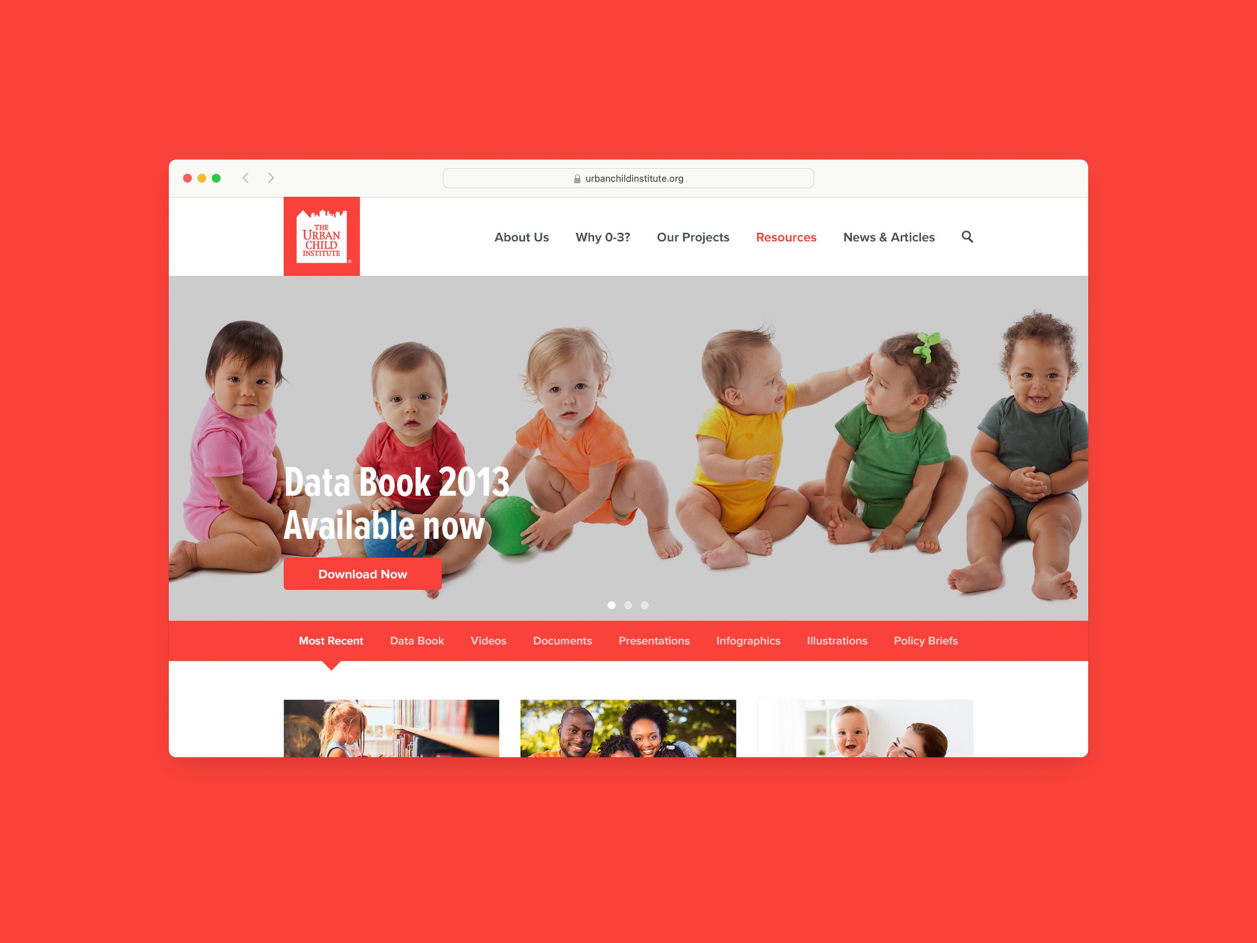
Using this new visual language, we also redesigned their website to more effectively communicate their mission and share strategic initiatives, research, and impact with partners locally and globally. The new site positioned The Urban Child Institute as both a trusted community resource and a thought leader—bridging science, strategy, and storytelling in one unified experience.
Creative Direction, Leadership & Design: Conviction / Additional Leadership & Design: Chris McCaddon

Old logo

Revised logo