

What began as a website redesign quickly evolved into a full brand refinement for the Levitt Shell—a nonprofit music venue in Memphis with a mission to build community through music and education. While their logo was relatively new, it lacked the flexibility and visual presence needed to stand alongside vibrant concert artwork and resonate in a crowded cultural landscape. Our goal was to help the Shell look as relevant and exciting as the music it brings to life.
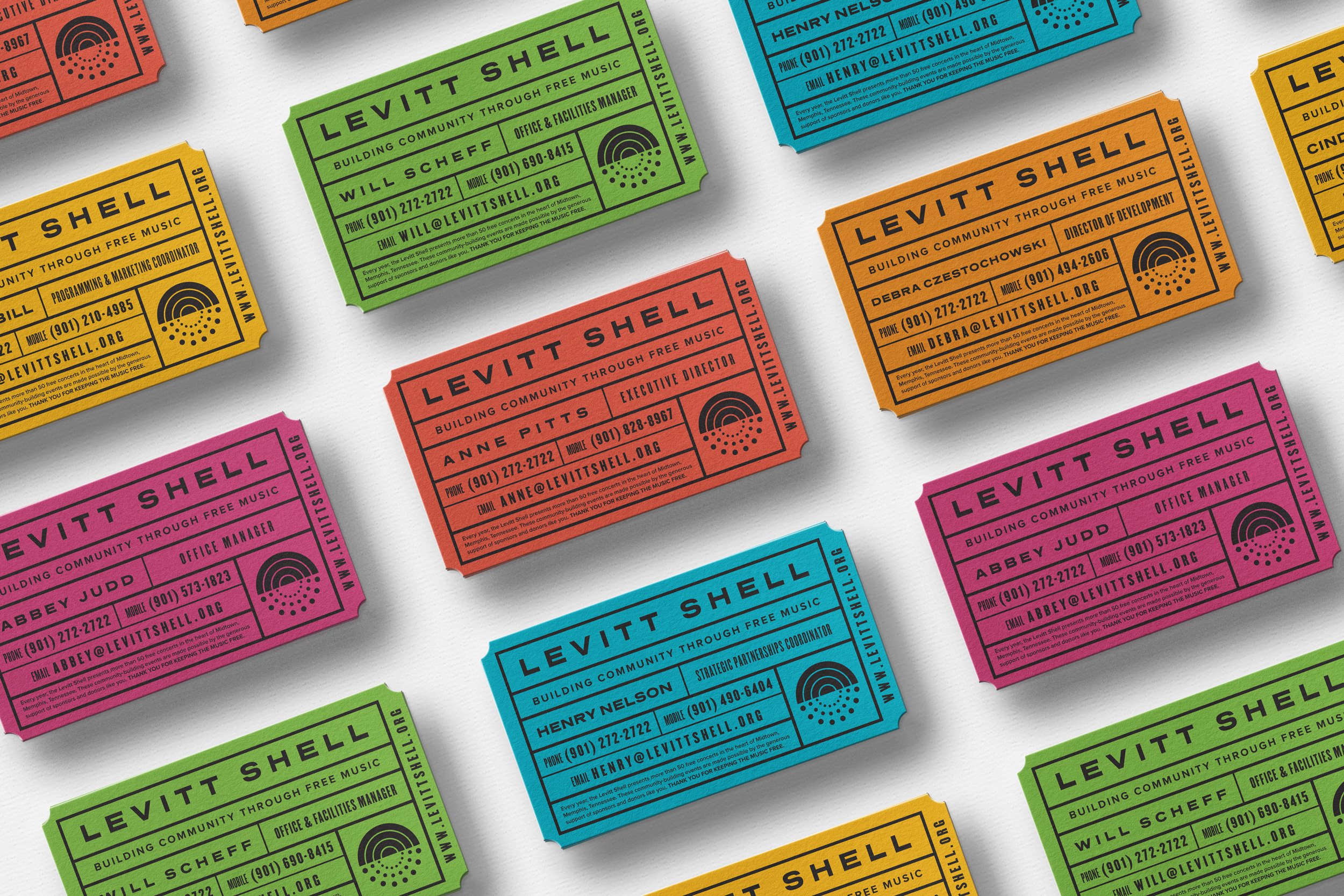
We refined their logo for clarity and usability—especially in single-color applications—and created an extended system of badges and marks that echoed their mission and identity. We also developed unique stationery, business cards, promotional materials, and apparel that helped boost visibility and establish credibility with cultural stakeholders. The result was a brand that felt both grounded in purpose and alive in the present.
The refreshed identity immediately expanded the Shell’s reach and relevance—helping them engage new audiences and deepen relationships with longtime supporters.

Old logo

New logo

Horizontal logo


“When we partnered with Josh Horton to reimagine the Levitt Shell brand, we were entering a new chapter in the organization’s life—a time of growth, deeper community engagement, and broader audience reach. Josh led a full redesign, including a new logo, website, signage, and print materials. The impact was immediate and far-reaching. The refreshed brand gave the Levitt Shell a distinct, contemporary identity that better reflected our mission. It helped us engage a younger, more diverse audience while deepening our connection with longtime supporters.”