

Emerge Memphis is a key player in the region’s innovation ecosystem, offering strategic support to startups, innovators, and entrepreneurs across the Mid-South. As a new executive director stepped in, he approached us to help refresh the brand, website, and communication strategy to reflect a stronger, more modern vision heading into 2020.
The existing identity—over a decade old—felt dated, out of touch, and lacked the flexibility or clarity needed to connect with the entrepreneurial community. Rather than pursue a full rebrand, we reimagined the original mark by refining and reusing its core forms. The result was a bold, modern “E” symbol doubling as both stairs and a visual reference to the building’s architecture—reinforcing the idea of progress and elevation. We paired it with confident typography and a refined design system to restore clarity and credibility across all media.
The refreshed identity launched with a new website, brand campaign, and poster series that communicated the nonprofit’s renewed focus and leadership. It marked a new chapter for Emerge Memphis—one that reestablished its relevance, built stronger connections with community partners, and signaled a new era of entrepreneurial support in the city.

Old logo
New logo
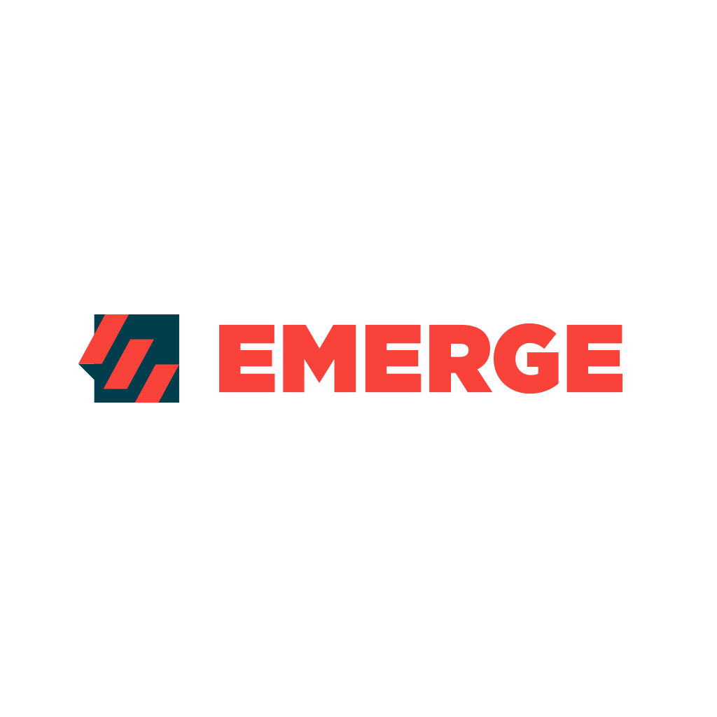
Horizontal logo


